Home Structural Products & Services, Stairlifts
Furniture, Clocks,
Accessories
Antiques, Folk Art,
Fine Art, Auction Houses
IN DEFENSE OF CURSIVE by Judith Thurman
As oflndependence Day, 2012, forty-five of the fifty United States have adopted the |
|
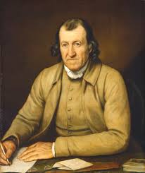
He was, apparently, Timothy Matlack, a New Jersey-born Quaker who moved to Pennsylvania at the age of fourteen, in 1744. Little is known of his education, though he was no humble Bartleby the Scrivener. He became a respected merchant, surveyor, and architect in Philadelphia. He was also a fiery patriot of the radical Whig persuasion; an ardent abolitionist; a delegate to Pennsylvania's constitutional convention; and a colonel in that commonwealth's militia, who fought in the battles of Trenton and Princeton. |
|
After the Revolution, Matlack was named a trustee of the University of Pennsylvania and a
member of the American Philosophical Society. With Benjamin Franklin and others, he founded the Free Quaker Meeting House, in whose graveyard he is buried. (He was also a star prosecution witness at the trial of Benedict Arnold, in 1779, testifying that Arnold
had imposed "menial offices" on the "sons of freemen," including his own son William.) It is not known how, or definitively even if, Matlack was selected to "engross" the
Declaration, though most histories credit him with the job. Using a feather-quill pen with a sharp-pointed nib dipped in iron-gall ink (the same ink that Leonardo had used some four hundred years earlier), Matlack copied the words onto a piece of vellum (fine |
|
 |
 |
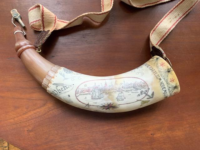
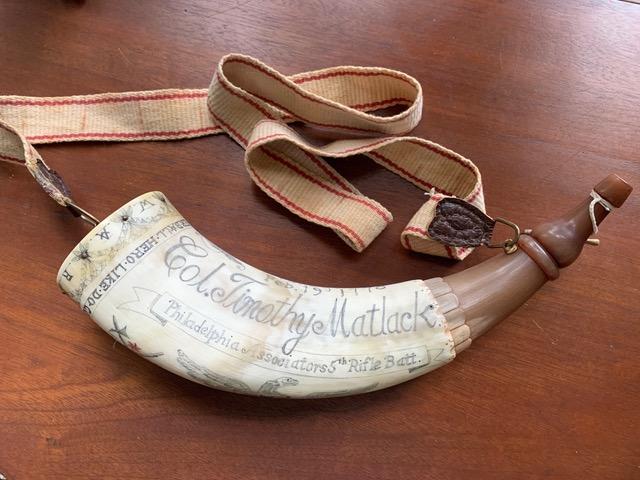
| Timothy Matlack's Powder Horn | |
| As an English teacher's daughter who started her career at The New Yorker when the formidable Miss Eleanor Gould was the chief copy editor, I always read with a red pen. Matlack misspelled the word "Brittish" [sic], and he spells the name of his home state with one "n" or with two in different instances, but "Pensylvania" [sic] is, to be fair, the alternate spelling that was used on the Liberty Bell. The most prominent tic of Matlack's style, at least to a modem eye, is the ubiquity of capitalized nouns, and not just those alluding to a deity ("God," "Creator," "Supreme Judge," "Providence," of which there are only four mentions); solemn abstractions (Laws of Nature, sacred Honor, Life, Liberty, Happiness); honorifics (Governor, King, Prince, Citizens); institutions (Military, Government, Legislature) but a passel of common names as well: Facts, Object, Lands, Foreigners, Murders, Laws, Coasts, Boundaries, Records, Cruelty, Object, Savages (as in "merciless Indian Savages") and many others. And why, in the first sentence-"When in the Course of human events ... "-should "course," (a matter-of-course word if there ever was one) be given this distinction? The most prominent tic of Matlack's style, at least to a modem eye, is the ubiquity of capitalized nouns, and not just those alluding to a deity ("God," "Creator," "Supreme Judge," "Providence," of which there are only four mentions); solemn abstractions (Laws of Nature, sacred Honor, Life, Liberty, Happiness); honorifics (Governor, King, Prince, Citizens); institutions (Military, Government, Legislature) but a passel of common names as well: Facts, Object, Lands, Foreigners, Murders, Laws, Coasts, Boundaries, Records, Cruelty, Object, Savages (as in "merciless Indian Savages") and many others. And why, in the first sentence-"When in the Course of human events ... "-should "course," (a matter-of-course word if there ever was one) be given this distinction? Some commentators claim, unpersuasively, that the capitals were, like italics or bold face, there for emphasis. But the most lucid explanation that I could find comes from an article at Slate, by Jon Lackman, published two years ago, which notes the propensity of contemporary Tea Partiers to use anachronistic capitalization as a way of asserting their kinship with the founding fathers. (O.K., Founding Fathers.) "What the capital-ist Tea Partiers fail to realize," he points out, is that the actual author of the Declaration of Independence, Thomas Jefferson (who wrote it with the help of John Adams, Roger Sherman, Benjamin Franklin, Robert Livingston, and James Madison) was extremely frugal with caps when composing his own draft of the document: "life,""liberty," "happiness," and even "god" are lowercase. (Jefferson, one should recall, was a passionate champion of the separation of church and state. He was raised as an Anglican, the established church of colonial Virginia, but he was deeply influenced by Deist philosophy and Unitarianism. When he ran for President, in 1800, he was attacked as a "howling atheist" and an "infidel." He considered much of the Bible (the bible?) to be "so much untruth, charlatanism, and imposture." "Millions of innocent men, women and children, since the introduction of Christianity, have been burned, tortured, fined and imprisoned," he wrote in 1787. "What has been the effect of this coercion? To make one half the world fools and the other half hypocrites; to support roguery and error all over the earth .... ") Lackman is not sure why, exactly, Matlack was so liberal with caps, though he quotes Benjamin Franklin's hypothesis that scribes like Matlack, who learned to write English prior to 1765, "imitated our Mother Tongue, the German." It is also possible, he suggests, that weighty majuscules "lent an appearance of power, the patina of age, and the ornamentation due to a grand gesture." A grand heretical gesture, one could add. And in that spirit of independence from the tyranny of"relevance," let's preserve cursive. |
|


